Covering A Couple of Classics
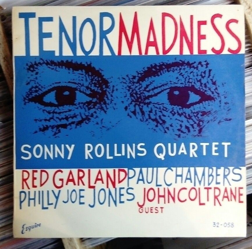 Let’s catch up with a few more from our watch list, starting with a pair of Newks: Sonny Rollins, Tenor Madness, Esquire 32-058. This was an original U.K. pressing listed in VG+ condition, although there was surface noise mentioned in the description, so there was some risk involved by the buyer. I guess it depends on your tolerance for noise. The cover was listed in Ex- condition. The final price was about $266. Seller describes the cover artwork as much better than the U.S. edition, which is certainly in the eye of the beholder, but I do tend to like the cover art on these U.K. Esquires as well. As for these two covers, I don’t have a strong preference one way or the other, although, if forced to choose, I’d probably opt for the U.K. version. Along the same vein there was:
Sonny Rollins, Saxophone Colossus, Esquire 32-045. This was another original U.K. pressing, listed in Ex condition for both the record and the cover. The final price was about $450. For this one, I have no qualms in stating that I prefer the iconic U.S. cover over the U.K. cover. Does anyone disagree? Surprise me.
Here’s one more from that German seller who has been stuffing the $1,000 and $2,000 bins lately: Lee Morgan Volume 3, Blue Note 1557. This was an original pressing in VG++ (or better) condition for the record and M- for the cover. The final price was $1,913.
I’d take the U.S. covers for both Rollins records, although I do like the Tenor Madness art…the Saxophone Colossus (looks like the link was incorrect) not so much.
The 1557 was not an original 1st pressing.
Sorry, link should be fixed.
Question: does anyone know why they would have changed the artwork at all when these were released in the UK?
Also, I think the reason you might tend to prefer the UK art is because it is less familiar to you, and subconsciously you think “oh, new jazz from my favorite artists!” just a hypothesis. i have nothing to back it up. I know I do that, anyway.
GTF:
I recall reading that the powers that be at Prestige wanted to give local UK artists the opportunity to be recognized, hence the change in artwork. I consider the Esquire artwork quirky and beatnik in its style – I like it (although I do prefer the US Saxophone Colossus artwork … so dramatic).
yeah, probably part of the licensing arrangement. Some of the Esquire covers are really cool. In a way, a number of them remind me of early Grove Press paperback designs (cue the beatnik foot-tap).
I’ve only been able to compare a couple of Esquire pressings against their Prestige counterparts and thought they sounded amazing. Both were mastered by Rudy Van Gelder and had RVG in the deadwax. It’s been awhile but I thought the Esquire vinyl was a better quality as they seemed to play quieter. Prestige seemed to skimp on production costs wherever they could.
if these style uk pressings get beat they get really beat…………but if they are clean that can sound amazing. I have “chambers music” (jazz west)- on not uk but i believe italian press……sounds cleaner than if u found ten jazz west pressings, i swear dog!
The Morgan was one I was critical of in the comments of a previous post. There is some pretty significant wear with chipping on the seams. Also, there is paper missing from a tear on the back, and significant soiling that encompasses more than run-of-the-mill seam wear. Another reader said he had good experiences with the seller, but the condition of this cover is in no way near the described m-. I tremble in fear for the vinyl.
I have a 10″ Barclay pressing of Miles David All Star Sextet, originally as Prestige 182 and later as Prestige 7076 for those keeping score at home. I picked it up on a whim for about US$5. The cover art is not as nice as the US press, and the US cardboard covers are such more substantial in construction, but the vinyl appears to use the US press parts (RVG, etc.). The vinyl is in the +-++ range and sounds pretty good. US pressings can be hit-or-miss in terms of press quality in this era. I don’t know if this is true of European pressings of the same time period, but I’m happy to have a decent pressing of great music.
Mac:
that’s a nice thing. interesting, too. that must have cut a bit into weinstock’s bottom line, though, which is surprising, given his notorious penny pinching.
I only have 2 Esquires, Oliver Nelson’s “Screamin’ The Blues” and Paul Quinichette’s “For Basie”.
Both UK covers are merely rehashed versions of the US. “Screamin'” is red instead of green, with a cropped picture of Oliver and a change of font size, while “For Basie” is exactly the same text on plain yellow instead of blue / white.