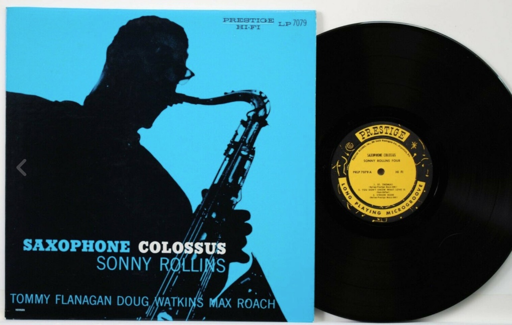
 Sorry, once again, for the long gap between posts. As this has become somewhat of a regular occurrence, I feel I owe some kind of explanation now that regulars such as Japhy and DaveS are calling me to task, rightfully so. I will do so in the next couple of days, but now that I’ve put aside some time to post, I feel obligated to go back to eBay and talk about jazz records as opposed to my own personal peccadillos, such as they are. So, here we have Sonny Rollins, Saxophone Colossus, Prestige 7079. This is a New Jersey yellow label pressing listed in M- condition for the record and perhaps the same for the vinyl. The bidding is in the $442 range with five days left. Not bad for a New Jersey pressing. I do have a question about Saxophone Colossus. I have a duplicate copy and a few weeks ago got into a discussion with one of our readers who was looking to make a trade.
We were about to reach a deal when he said he had just wanted to confirm that the “original” copy I was offering had the cover with the greenish tint as opposed to the bluish tint. I looked at my copes and both were more bluish than greenish, although they both had all of the other trappings of an original pressing, including the New York address, deep grooves, etc. I looked on Popsike and, sure enough, there were copies of Saxophone Colossus with covers that were more green than blue, kind of like the original Miles, Prestige 7014. My question is, does the greenish cover have that much more cachet to collectors than the blue cover? I personally don’t recall ever holding one with the green cover, so I assume it is quite rare, yet I also see copies of the blue cover selling for $2,000 to $3,000. In fact, if you look at Popsike, you will see that the highest price paid for a Colossus was $3,080, and that was for a blue cover version. The highest price for a green cover was $2,415. Rollins aficionado that I am, is this a nuance I simply missed over the years? As a collector, do you how much do you care about the tint on the cover, assuming that it may have been a legitimate first-off-the-presses issue of one of the most important records of the Jazz Collector Era.
Here are two Blue Notes from my want list: Cliff Jordan and John Gilmore, Blowing in From Chicago, Blue Note 1549. This looks to be an original New York 23 pressing. The seller describes the vinyl as nearly perfect, yet he rates it VG+. He describes the cover as VG-, but based on the description it looks more like VG to me. It’s not a dealer I know, but he has 100% feedback. Perhaps he is undergrading? In any case, this one is in the $400 range with less than two days left. Would it be worth a shot to fill in a gap in the Jazz Collector Collection? Hmm, could be. Horace Parlan Quintet, Speakin’ My Piece, Blue Note 4043. This looks to be an original West 63rdStreet pressing listed in VG++ for the record and the cover. The bidding is in the $160 range with more than five days left on the auction. A copy of this record recently sold for more than $1,300. While I wouldn’t anticipate this copy matching that one, I would expect the bidding to climb quite a bit higher than $160.

Wow. If the NJ Saxophone Colossus hit $1K, that would be something. On a related note, should I start snatching up all the BN White label Libertys I can reasonably find as prices for those 2nd and 3rd pressings inevitably climb due to big money chasing true firsts. Rising tide lifting all boats I guess.
I have heard the Colossus tint thing before. For those in the know who believe the greener tint makes it a first press, I have a few questions: 1) But is there any distinguisher on the vinyl itself? I would think not. 2) If no, who is to say it hasn’t been switched for one from a ‘blue’ tint copy over the years? 3) What evidence do we have that the greener tint was first?
These are genuine questions. I’m looking forward to learning the answers, if they are out there.
Is the green tint perhaps a printing error?
Maybe it’s the lamination that has yellowed over the years and we all know what happens when you mix blue and yellow. Also, sometimes you can’t be sure of the images from the net to be correct color-wise (far from it) as different lighting or lack of there could make a blue cover appear more green. White balance (I think?) not correct, warm yellow indoor light etc. My NYC copy has a turquoise aqua color, it’s not a solid blue for sure, more greenish. The word Colossus on the front is off white, light yellow as well.
Now, instead of obsessing about cover tints, relax, have a glass of wine and listen to Blue in Green…
Rudolf? Our prestige label expert . Your comment ?
Al, I prefer to think of the calling to task as just a gentle nudge born out our affection for (and perhaps addition to) the site. In the end, we’ll take what we can get!
I personally don’t care about green vs. blue covers, although being as the blue Rollins is arguably the more culturally recognized version, I think I’d prefer to have a copy of that one, which I sadly do not. If nothing else, I suppose it makes for a variation that sellers can point to in an attempt to squeeze out a few extra bucks.
Yes, taken with great affection and no offense. Believe me when I go that long between posts, I feel quite guilty, although this may actually be the longest I’ve EVER gone between posts. 🙂
Al, are your copies flat edge or not? In a comment to the July 26, 2017 JC post “Happy Holy Grail Day”, Woody wrote that the greenish cover was supposed to be first and the LP should have a flat edge. Woody, are you here to elaborate?
There were some other discussions I have read, including on the London Jazz Collector with respect to the “Colossus”, Prestige flat edge pressings, as well as the general quest to identify NYC Prestige pressings.
From that mosaic, it would make sense that the covers with the greenish tint were the earliest version. Partially, because reissues and the later pressings with the original cover art are all blue.
Also, it sounds like the cover should have a reference to GEM Albums as the printer in the lower right on the back. I wonder if both the greenish and the blue NYC covers are GEM. However, accoding to the discussion of the GEM covers, there shouldn’t be a variant without. If there were, it would definitely be a discovery, and, if greenish, would have a chance to be really the earliest. If blue, then I don’t really know what to think.
Rudolf was a very active contributor to all of those discussions, so he may choose to add something here as well because all those threads are now several years old.
For me personally, I really enjoyed reading Larry Cohn’s writings on Blue Note on his My Ebay page in the late 90s. Those were really eye opening and put a lot of things in order for me (such as NY labeled first presses by Liberty, for example). But now the depths some people go to trying to research something that is, let’s face it, impossible to make reliable conclusions about, seem really excessive to me given how rare, sought after and expensive those records have become. If one sees a decent NYC “Colossus” and one could afford it in principle, one should grab it because when would one come along again? And who cares if it’s greenish or blue?
Believe it or not, but yesterday, when Al must have been writing his last posting, I was comparing my three remaining copies of Sax Col. I have the NYC original, a Danish pressing with identical cover art and the Esquire.
As you know, I am slimming down, and in this process I sold my N.J. copy of Sax Col., which fetched just over 1350 usd two years ago. When I sold that one, I remember to have noticed that this 1958 N.J. version was bluer than my NYC copy. My NYC copy has slight greenish undertones, but is definitely blue, not green. When I compared yesterday the NYC copy with the Danish one, which is a reprint of the N.J. version, no adress on the rear, I noticed that one can distinguish the facial features of Sonny on the bluer copy, but not on the NYC one.
I have never seen a green version, although there is one on Popsike which seems to be green. In my view it is an anomaly or misprint. There cannot be a regular green version like we saw the shift from green to blue on 7014 and from yellow/green to red on 7105.
A first pressing should have a G E M sleeve and have the NYC adress on the labels and rear.
I participated in the Prestige label analysis for LJC. Flat edge is a non issue in Prestigeland.
Rudolf, that info seems to be password protected on LJC. I wonder however why Flta E is a non issue. Because of different pressing plants forking out 1st pressings or did I miss something. The general idea is that Flat Edges was quickly phased out in 1957 or something being replaced by the “raised lip” or “safety guard”.
Shaft: when we started to collect markers, regarding the vinyl, the labels and the sleeves, we put in all data available, before narrowing down to those features which showed a pattern in the development of the label.
The virtual absence of flat edged vinyl makes that it is not a distinct feature enabling to draw conclusions as to a 1st or 2nd pressings.
Most flat edged pressings are found in the 10″ series.
Re 12″ flat edge, I give the following illustration:
7007. 1st pressing. Plastylite 7 E client mark in dead wax. Lemon coloured label, block print, HI FI, sleeve non laminated, no pictures of other albums on rear; NYC adresses. Safety lip pressing.
7007. 2nd pressing. Non plastylite. Ochre coloured label, roundish print HI FIDELITY, laminated sleeve, Miles albums on rear incl. 7054. NYC adresses. Safety lip pressing.
7007. 3rd pressing. As per 2nd but N.J. adresses. Safety lip.
7221. Re issue of 7007. N.J. New sleeve design, but FLAT EDGE!
I checked Plastylite pressings of 7003 and 7005. Both have safety lip. Same for first issue unlaminated green cover 7014 and 3rd pressing N.J. blue cover 7014, both have safety lip.
On the top of my head, I seem to remember that 7052, Plastylite has a flat edge.
All the above is to show you that there is no pattern. Bob made his choices haphazardly, but stuck most to AB (Abbey), who, as far as we know did not produce flat edged vinyl.
“7007. 1st pressing. Plastylite 7 E client mark in dead wax. Lemon coloured label, block print, HI FI, sleeve non laminated, no pictures of other albums on rear; NYC adresses. Safety lip pressing.”
Two corrections regarding the 1st pressing of 7007, it actually has “Non-Breakable High Fidelity” on the label and is a flat edge pressing.
Looking to this N.J. Saxophone Colossus item now on EBay. Seller claims 1958 as year of issue. IMHO this is a later pressing, or at least sleeve!
When Prestige moved to Bergenfield they started with sleeves from which the NYC adress was deleted. 1958 sleeves with N.J. labels tend to have no adress on the rear. Gradually new covers were printed with the Bergenfield adress.
The N.J. copy I sold some years ago for 1350 + had no adress on the rear, this one has.
Rudolf, I see what you mean but I’m still a bit puzzled. The flat edge is in the metalwork=stamper right?
For Plastylite and Blue Note they had to make new stampers to introduce the safety lip. This happened for the BN1500-series as you know. My theory for Plastylite is that they at some point in time just decided that all LPs should have safety lip and they scrapped the old metalwork for lots of titles whose metalwork they normally should have used for several years. If I understand it right Plastylite did not press up a lot of stock but pressed smaller batches according to the demand.
Anyway, according to your statements about Musings of Miles 7007 are we sure that there was no Plastylite flat edge pressing pressed in 1955? The old style NY labels could have been reused for a new stamper in 1957? Anyway it seems strange that a 1962 reissue with presumed Yellow Bergenfield NJ labels should have Flat Edge. If it has NJ labels an old stamper must have been used – could be an anomaly? If no NY pressing has flat edge and NJ pressing has it’s indeed very strange. Is there an old label style AB pressing with HI FI and 1st font and color?
There could of course be variations between the pressing plants as you are hinting at. Also interesting is the Deep Groove variations of Riverside – many early pressings not being DG presumably made on the West Coast.
Regarding Abbey (AB) pressings I’m sure you are right. Same for Abbey 10″ pressings (if they made any?) Maybe they skipped the Flat Edge for 12″ altogether?
I own one of the “green” copies of Colossus (W 50th, flat edge, etc) and have wondered about its provenance for years. But rather than think of it as a question of blue vs green, I have thought of it as a question of light blue vs. turquoise, since my copy is really more turquoise than anything else.
So are the turquoise the first press? Or did Prestige print turquoise and light blue copies
simultaneously, like the first Coltrane LP that appeared in both yellow and orange?
Checked my NY Colossus 7079 copy again. I have to my eyes a blue cover with maybe a green tint. Sure looks mostly blue on quick glance. Definately Flat Edge. The Pressing says “AB” which is for Abbey Plant I think.
Of course, there is no true green Colossus (such as the 7014). We are talking greenish, turquoise or whatever tint away from the blue.
David abd Shaft, are your covers printed by GEM?
David, is your record flat edge?
Ilya Yes, printed by GEM.
I think the flat edge vs safety lip and green vs blue, via turquoise, questions need to be seen in the light of each individual’s personal perceptions.
When one speaks about a NYC 7079, G E M, AB pressing with a flat edge, I wonder what the definition of flat edge is. For me it is the empty space, without rim at the outside, and without guiding lines, leading directly into the playing surface. Best examples are the early French Vogue/Swing.
I just cannot believe any 7079 to exist with an authentic flat edge pressed by AB.
On the contrary, I could conceive, as suggested by Shaft, the existence of flat edge Plastylite pressings of 7001 through 7007. I never saw them, but I don’t exclude that they exist.
I have indeed the 7079. The AB marking is in capital letters and it looks hand etched. Maybe that is not how an AB Abbey marking should look? But the LP is definately as flat as it can be. Like ruler flat all the way out.
“I could conceive, as suggested by Shaft, the existence of flat edge Plastylite pressings of 7001 through 7007. I never saw them, but I don’t exclude that they exist.”
Rudolf, I have a flat-edge Plastylite copy of 7007 so can confirm it exists.
Aaron, that is very interesting news. I will make a note of that.
Shaft: I took out my NYC copy of 7079 and ditto 7080 and also the Danish pressing of 7079.
All three have AB hand engraved.
I must admit that I was surprised how flat the NYC 7079 looks. One could argue that it IS flat. Knowing there should be a safety lip, I have the sensation of seeing the faintest elevation, but I could be wrong. 7080 and the Dane have a more pronounced lip, but still not very obvious. The question is now, to what conclusion does this lead us?
I think there is a distinction that must be made between the “flat-edge” which you find in a Lexington Blue Note and the flat-edge seen occasionally on titles later in the 1500 series and up to even around catalog number 4010. The former is completely flat and seems almost beveled on the edge, the latter is physically flat or sometimes tapers out to a point, either way with no obvious “Bead” on the edge or dramatic lip. They aren’t the same, but you could describe both as having a flat edge.
I have a larger sample size of Blue Note LPs than Prestige, but for example I do have an original vinyl copy of Informal Jazz (it came in the 2nd press cover) and it has a physically flat edge but nothing like the flat-edge seen as an indicator of the earliest BN pressings. This copy of informal jazz is obviously not a 1st pressing (early run) despite this.
Are we all talking about the same thing in regards to Saxophone Colossus? or just a physically flat edge. As Rudolf said, Abbey was not known to product (truely) flat edge vinyl.
Hope that makes sense.
Also, I disagree that the lacquers would need recutting, or any metalwork scrapped, to incorporate the safety edge. Rudy’s matrix etching for the early BN titles has a very distinct hand, written in large characters. If these were recut, they would be different by the time they were repressed in the 47w, NYC, Liberty era, etc.
Whoops, I mixed up the distinction between re-cutting, and making new stampers. Carry on.
As an aside, since it is clear that both the safety lip and Plastylite P/Ear are features of the individual stamper, it would also lead to the conclusion that later Liberty era pressings use freshly made stampers (and do not carry the P/Ear as a result).
Fascinating stuff
Ahh, this ongoing discussion is why I love Jazzcollector.com. These delightful discourses and sharing of information. Like the old days when all you learned you found out on your own or in various and sundry manners.
I no longer have Saxophone Colossus 50th, so who knows the color, thus I can’t add any knowledge, in fact I only have about 75 records left.
Regardless, this has been/is a fun read for me. Thanks.
JC and LJC are definitely places where to learn a lot about records. I remember i contributed of the Prestige and Riverside pages in LJC. It was really exciting.
Maybe the difference between blue and turquoise on Colossus comes from lamination foxing, where record was shelved etc….
A-B: you said it all. It is the physiognomy of AB pressings which come with more or less visible or feeleable beads or rims, but are basically the same. They all have in common the 5 or 6 entrance grooves with a more or less pronounced safety lip.
I checked 7043, Informal Jazz. My second issue, the brown sleeved Two Tenors, has not the ‘flat’ edge as you describe. My 1st pressing ‘Informal Jazz’ has a flatter edge, and my copy of the equivalent on Esquire (also marked AB) is somewhere in between.
I am not very much into Blue Note, but I took out a flat edge at random, 1508. It is definitely another thing compared to an AB.
Could it be that AB entered into the business only in the post flat edge era? I have no idea.
It says “AB” not “A-B” if it makes any difference. I compared the flat edge with a couple of early Blue Notes with flat edge and IMO they are just the same “flat edge wise”.
I would of course be happy to share some pictures. Maybe we are missing something here?
My 7007 is a Bergenfield NJ pressing with the typical Safety Lip and no GEM Cover.
I wrote A-B for Abrasive-Beautiful.
Rudolf – ah ok my slow brain did not make the connection. 😉
Sorry delayed reply: yes, my “turquoise” Sonny is printed by GEM on the back and is also flat edge.