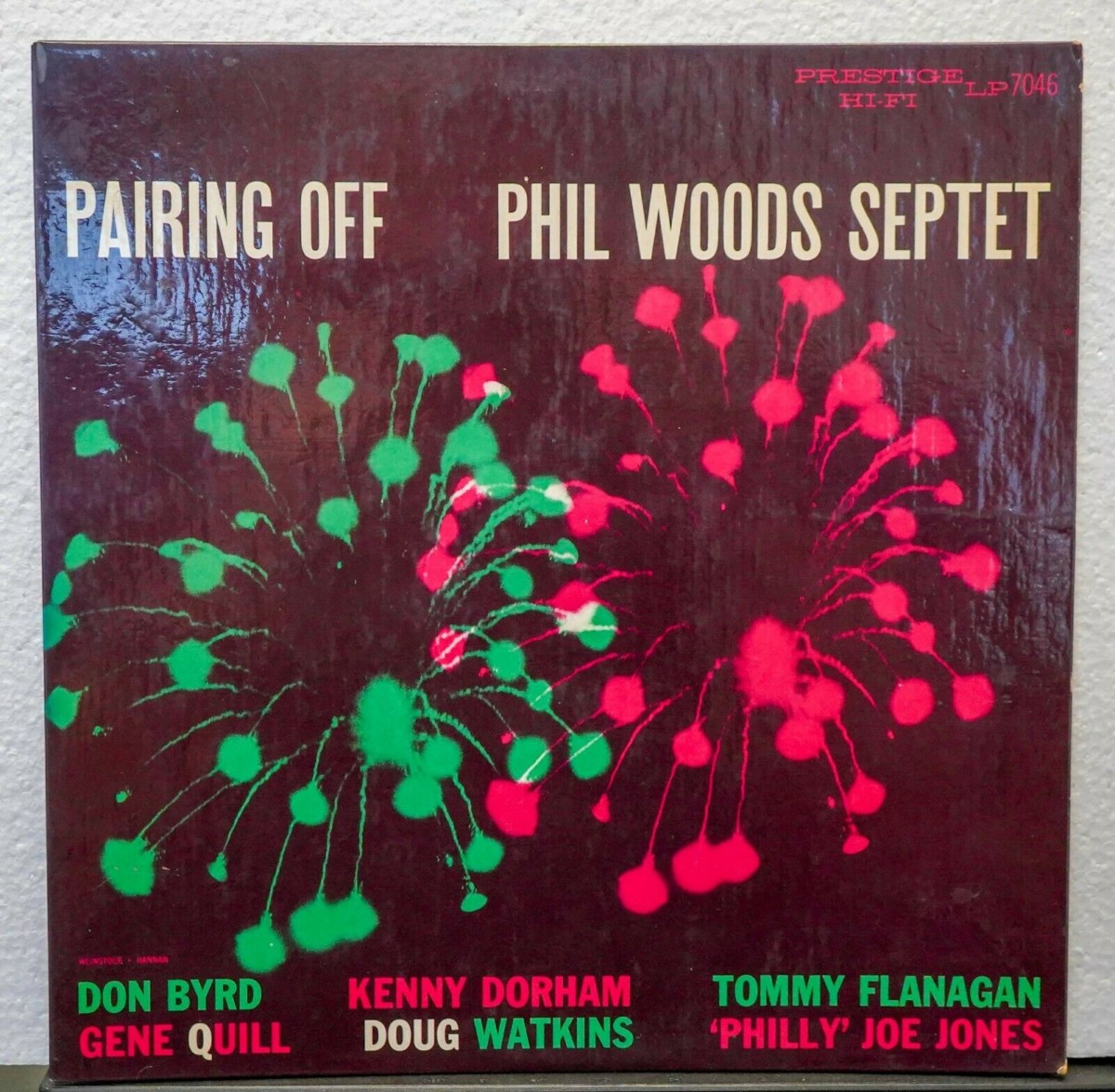
 Time to catch up on some rare jazz vinyl we’ve been watching on eBay, starting with Phil Woods Septet, Pairing Off, Prestige 7046. This was an original New York Yellow label pressing that looked to be in M- condition for both the record and the cover. When we wrote about the record last week at Jazz Collector, the bidding was in the $300 range. The record sold for $1,225. According to Popsike, that’s the highest price we’ve seen for that record. I’ve been saying that so often lately, I’m beginning to sound like (fill in the blank, I’m too embarrassed to write it). Anyway, this one was sold by the Jazz Record Center and here are some additional items from the same auction:
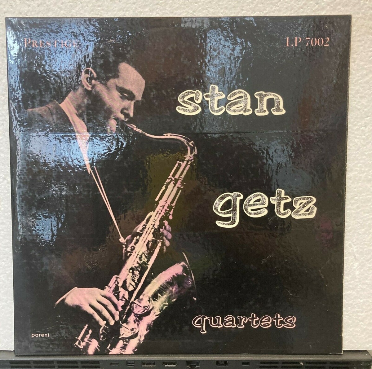
Stan Getz Quartets, Prestige 7002. This was an original New York yellow label that looked to be in M- condition for the record and the cover. The final price was $363.
Booker Ervin, Exultation!, Prestige 7293. This was an original New Jersey yellow label pressing that also looked to be in M- condition for the record and the cover. The final price was $317.34.
Bobby Jaspar, Tenor and Flute, Riverside 240. This was an original white label pressing that looked to be in M- condition for the record and probably VG++ for the cover. The final price was $212.50. Interesting sidemen: Idrees Sulieman, George Wallington, Wilbur Little and Elvin Jones.
Finally, there was that collection of 29 Blue Notes in not-so-great-condition, described by the seller as “filler lot only.” The final price was about $1,390. I have to admit, I was tempted, even if just to see the records. But $1,400 was a bit steep for my curiosity. But, if the buyer is out there reading these, I am sure I am not the only curious one about the actual condition of these records and covers. I’ve been looking for that Lou Donaldson Quartet, Quintet, Sextet for years, but I stopped buying records that I can’t confidently put on my turntable.


Pairing Off is a wonderful record and that looked like an exceptional copy. Understandable price, in my estimation.
I second Clifford. Pairing Off is gorgeous. Philly Joe a key player on this one, not to forget Doug. The pairing of Byrd and K.D. and Phil / Quill reminds me of a later similar Prestige album, Interplay for Two Trumpets and Two Tenors, # 7112. I am happy that the intrinsic artistical value of Prestige productions of the mid fifties is finally recognised and translated into corresponding price levels.
The Getz looked lovely with the immaculate front. A strange mix of a second print sleeve and what looks to me a first pressing set of labels. Why a second print ? Because of the later albums advertised on the rear.
Several years ago, I got a copy of that Stan Getz in VG+ shape. Original disc, but clearly not original jacket. Not laminated, etc. Odd.
gregory the fish, some early Prestige first pressings do not have laminated jackets, like 7005 and 7007. Does your Getz have ads on the back? If not, it might be an original.
Aaron, I would like to make a bold statement : the low numbers in the 7000-series originally did not have laminated sleeves. Interesting to find out where the turning point is. Somewhere in the 7030/7040s? My Jon Eardley Seven, with Gil Mellé ‘s cover is still unlaminated, my 7035 too. Or even later? In the 7050-s? I believe my Monk, 1st pressing 7053, portrait sleeve, is unlaminated.
I kinda prefer the New Jazz cover of the Getz, Long Island Sound, and am still on the lookout for a sharp and clean copy of that one. Getz isn’t my favorite saxophonist or musician by any stretch, but that cover gets under my skin!
Clifford, I also have always been infatuated by that “Long Island Sound” cover on New Jazz. About 10 years ago I was lucky enough to grab a nice copy for $35 at Dusty Groove Records. I hope you find a good copy at a reasonable price this year.
When I found an impeccable copy of L.I. Sound, I ditched my 7002 and Esquire originals.
Clifford, I have always been an ardent admirer of Esmond Edwards’ cover art. Take the portraits/coloured blocks group: Soultrane, MAL/3 and 4. Prime examples of using space, colours and a portrait.
Long Island Sound has the double sense of sound in the title and this dreamy unreal atmosphere which one finds in the music. The colour adds a lot to create this airy atmosphere.
Compare this with the straight approach of Parent on 7002 and many similar for Prestige and Debut.
aaron: no ads. how nice! it was literally $5 at a roadside shop that I stopped at spontaneously on a road trip.
Speaking of Esmond Edwards colour block cover art there is one very elusive example. The Wardell Gray Memorial om Prestige 7008/9 typically has a photo of Gray playing his King Super 20, but I once saw a different cover on an auction site. This was very similar to the Clifford Brown Memorial on 7055 with colour blocks and the same motive taken from a slightly different angle. Does anyone know anything about this? Whis was the original?
Staffan Lindstrom, is this the one?
https://www.discogs.com/Wardell-Gray-Memorial-Volume-One/release/16899369
Aaron/Staffan: the Clifford Brown Memorial album # 7055 has its cover design attributed to Hannan and Edwards. It may very well be the first time Edwards’ name appears on a sleeve.
The very similar sleeve design of # 7008 and 7009 was for a second issue. The first issue had a picture of Wardell, courtesy Ray Avery, red letters on 7008 and blue on 7009.
Thanks Aaron and Rudolf for the info. The one Aaron sent a link to is the one I mean. Does volume 2 have a different colour? Anyway, I find that kind of photo fascinating and would much prefer to have that cover (I only have the OJC reissue with the Gray photo). But it seems to be extremely rare. And Tom Hannan is seldom mentioned as being one of the greatest. It is all Reid Miles. Btw, one who never gets the credit for being an outstanding photographer in this genre is Prestige boss Bob Weinstock himself, e.g. The New Miles Davis Quintet 7014 and Wail Moody Wail 7036. Very atmospheric.
Steffan: my 2nd vol. Gray, # 7009, 2nd issue has the same colour as vol. 1.
You rightfully mention Hannan. He was something special indeed. The minimalist approach on 7038, with just 2 colours on white is a nice example.
Bob Weinstock contributed some very nice pictures.
I think we must say that Tom Hannan created the colour block/photo concept and that Esmond Edwards continued with it on those albums you mentioned. Other examples are Shirley Scott´s Great Scott! 7143 and perhaps Coltrane and Quinichette 7158. Both are great albums.